

Showing posts with label Album. Show all posts
Showing posts with label Album. Show all posts
Sunday, 15 December 2013
Sunday, 24 November 2013
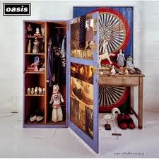
digipak analysis
Velvet Underground and Nico

Thursday, 14 November 2013
suck it and see poster analysis
This advertisement uses two colours and is kept very minimal. this use of colour is very subtle as well as neither of the two are stand out, bright colours that you expect to see as a way of gaining some attention. Also as a well known band the largest text on the page is their name to make them stand out. The next thing is the album name which allows the reader/listener to research into the new album. in small print at the bottom of the page is some advertisement for the record company via their website and logo. I have been inspired by this in terms of the central layout and content. However I have spaced out my page a bit more so the is a bit less empty space.

Sunday, 27 October 2013

Tuesday, 8 October 2013


Monday, 7 October 2013


Thursday, 26 September 2013

Subscribe to:
Posts (Atom)