Showing posts with label Jack Gogerty. Show all posts

Monday, 16 December 2013

Evaluation Question 4 - JG

Question 4. How did you use media technologies in the construction and research, planning and evaluation stages?

Technology we used:


Photoshop - Photoshop was a vital element in the production of my digipak and poster as it is where they were created. Using layering and text etc. I was able to make a professional looking piece of work that had a strong sense of branding and fitted the target market and music genre. It was good for the smaller details such as editing the lucky number logo to make it stand out in red. I also used the grid function to keep the majority of my design central to the page.


Digital still camera - This was for planning shots and getting location shots. This wasn't vital for our work and it wouldn't of affected us had we not used it. The main reasons for using the still shots were for getting the frames right before shooting and it was useful to be able to capture the filming process for our blog.


Digital video camera - This was the main technology used when filming the video, we used a HD camera. It caused some problems in the editing process as the clips were filmed in the wrong format and needed to be converted to an editable format such as mp4.


iPhone - I didn't learn a lot when using the iPhone as it is something that I used everyday. It was utilised to allow contact between me and Tommy etc. We also set up a schedule on our phones using timetables and the calendar so that we knew when everything was happening. It was helpful to have a phone in use when communicating with the band as well as it is quicker than emailing and other alternatives.


iPod - For simply playing the song whilst filming and allowing the singer to learn the lyrics before the filming day. Again nothing was new to me about this.


Twitter - I used the social networking site twitter in an attempt to promote 'Odessa Soviet' in a professional manor. I aimed to hit our young target market through the website as it is something that they would use on a regular basis, I feel that this has taught me more about the working of a band etc. I didn't manage to keep on top of the account as well as I should have and didn't use it enough to gain many followers to make it worthwhile.


Blogger - One of the main technologies throughout the projects has to be blogger. Used throughout the process in research, planning, production and evaluation to post the pieces of coursework produced. As well as just posting straight on to blogger it allowed me to link the bands twitter account etc. It also allows for the posting of things such as Scribd documents and you tube video which helped a lot when posting my ancillary texts.


Email - I received some feedback via email which has made the evaluation process a great deal easier.


Youtube - This was a social networking site used when posting our video and draft video live on the internet. It was a simple process but something I hadn't done a lot before. The main thing to learn was how to upload from final cut pro to the site. This site also made researching any existing videos extremely easy.


Lighting - Lighting helped to make the music video we created into a more professional looking piece of work. As we filmed in a drama studio there was a lot of lighting built in at different angles which helped us light up the performing area evenly. we could also dim individual lights to leave the focus on specific band members etc.


Final cut pro - When editing my video and draft I used final cut to make a realistic video that flowed well with a variety of shots. I also dragged in some Photoshop files to supply text to the video at the beginning an also as it faded out. Another feature I utilised was to get a frame at the beginning to make the shot have the effect of being viewing on the camera screen.


Youtube to mp3 - I used this when downloading the song from you tube to make sure we editing in time. The song was from the official Darwin Deez video so we knew it would be ideal with the footage alongside it. 


UK tribes - UK tribes was the main site that I used in order to gain knowledge about my target market and what they liked. It helped me look at who might enjoy our video and therefore who I should to aim it at.


Evaluation Question 3 - JG

http://jackgogerty.wix.com/jackgogerty-eval3

Sunday, 15 December 2013

Evaluation Question 2 - JG


Evaluation Question 1 - JG

EVALUATION 1. In what ways does your media product use, develop or challenge forms and conventions of real media products?

USE
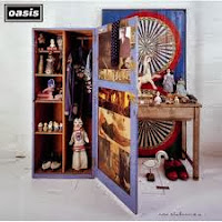
For our Radar Detector music video we have used an array of other bands videos to generate ideas and create realistic shots. An example of this is shown in an Oasis video but we have given it a more relaxed feel with a less polished look, this was easier to do due to our budget etc. We also took ideas from the likes of .........


For the 'presents' part of my text I saw a logo that did what I wanted as it came in two parts and stood out well on its background.


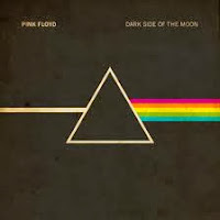
My poster and digipak were strongly related to people such as the Arctic Monkeys who have had great success with their music and fit in with the type of band that we have tried to produce. The layout and fonts used are similar. As far as the colours on my digipak and advertisement are concerned we took inspiration from many bands including Pink Floyd, The Black Keys and the Maccabees. These were used because .........


DEVELOP
For my text i took the warping idea from Superman and developed it to be in a more modern style that would fit in with my genre of music. I also took inspiration from an Arctic Monkeys 'Suck it and see' posters main text which also uses a warped effect.
 
CHALLENGE
I challenged the conventions of existing products within my genre by changing the colour scheme. Although there are some with similar colours as shown above it is more light colours that are usually used.

Monday, 9 December 2013

Evaluation Question 2 - First Draft

EVALUATION 2. How Effective is the Combination of Your Main Product and Ancillary Texts?


My digipak and poster advertisement clearly linked through the use of fonts and colours, also the layouts are similar in terms of almost everything being central etc. In terms of links with our video i think they both fit in with the genre and the dark colours tie it in. 


The video links with the use of colour as well, e.g. the drums are a similar blue to the one used in my advertisement. The layout of shots and the way its framed it is simple to show off the band members and the music they produce.


They are different due to the fact that the video is far less polished in terms of its look than the rest of my products. I think that the video looks more like a ........... video than something by the arctic monkeys however my poster etc. are based around existing products that are by the arctic monkeys. 

Tuesday, 26 November 2013

Changes to filming techniques etc.

In the draft video we didn't use a wide range of shots or cuts. for example we only had long shots of the whole band or a variety of close ups focusing on just one member, for our final shoot we need to add more mid range shots and pans. Also when editing we need to cut between shots using fades and zooms etc. Other improvements that I think we could make is to have more artificial lighting to make it look a lot more professional. The band members to to be changed and need to actually know how to play the drums/guitar as in the draft it is very obvious that they do not know how to play.

Sunday, 24 November 2013

digipak analysis

Velvet Underground and Nico
Minimal cover with a very eye catching design. This was made famous through the use of international artist, Andy Warhol. This produces a link between pop-art and pop music.

Thursday, 14 November 2013

suck it and see poster analysis

This advertisement uses two colours and is kept very minimal. this use of colour is very subtle as well as neither of the two are stand out, bright colours that you expect to see as a way of gaining some attention. Also as a well known band the largest text on the page is their name to make them stand out. The next thing is the album name which allows the reader/listener to research into the new album. in small print at the bottom of the page is some advertisement for the record company via their website and logo. I have been inspired by this in terms of the central layout and content. However I have spaced out my page a bit more so the is a bit less empty space.

Monday, 28 October 2013

Main inspiration

The Arctic Monkeys album 'suck it and see' has inspired me greatly when creating my own digipak and poster. The minimal layout is striking and makes the viewer notice whats important, the band and their album. Also I like the colour scheme evolving around two main colours instead of three although I have still used the conventional three.

Work for Friday 1st November

  • Film and edit draft video
  • Begin improving digipak and poster
  • Post on digipak/poster feedback
  • Test shots post

Digipak and poster feedback

Digipak- 6/10

I need to add the catalogue number and band name to the spine and include a larger track listing. Also the OS panel could be moved to the centre panel to make it stand out more. More research is also needed to get a higher mark.

Poster- 6/10

Just needs a lot more evidence to show that it is a realistic poster that matches my genre. With the added evidence it could easily get a better grade.

Draft digipak


Draft poster


Tuesday, 1 October 2013

To do list - by 06/10/13.

  • Storyboard
  • Animatic
  • Final shoot location
  • Exact equipment list
  • Props
  • Feedback evaluation